Understanding the Challenge
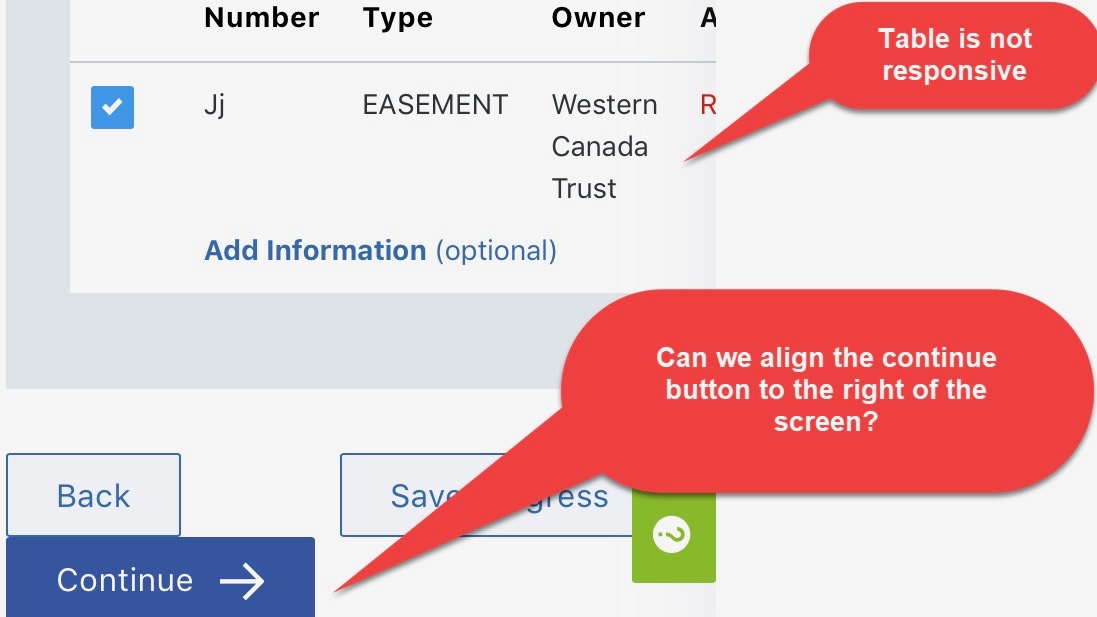
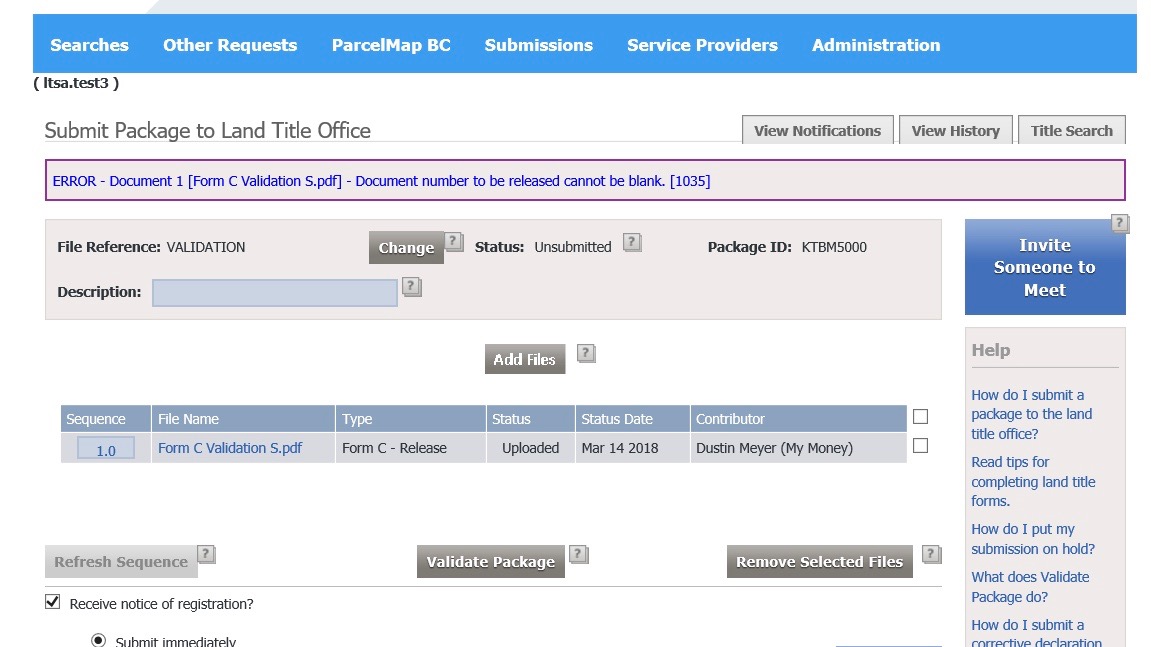
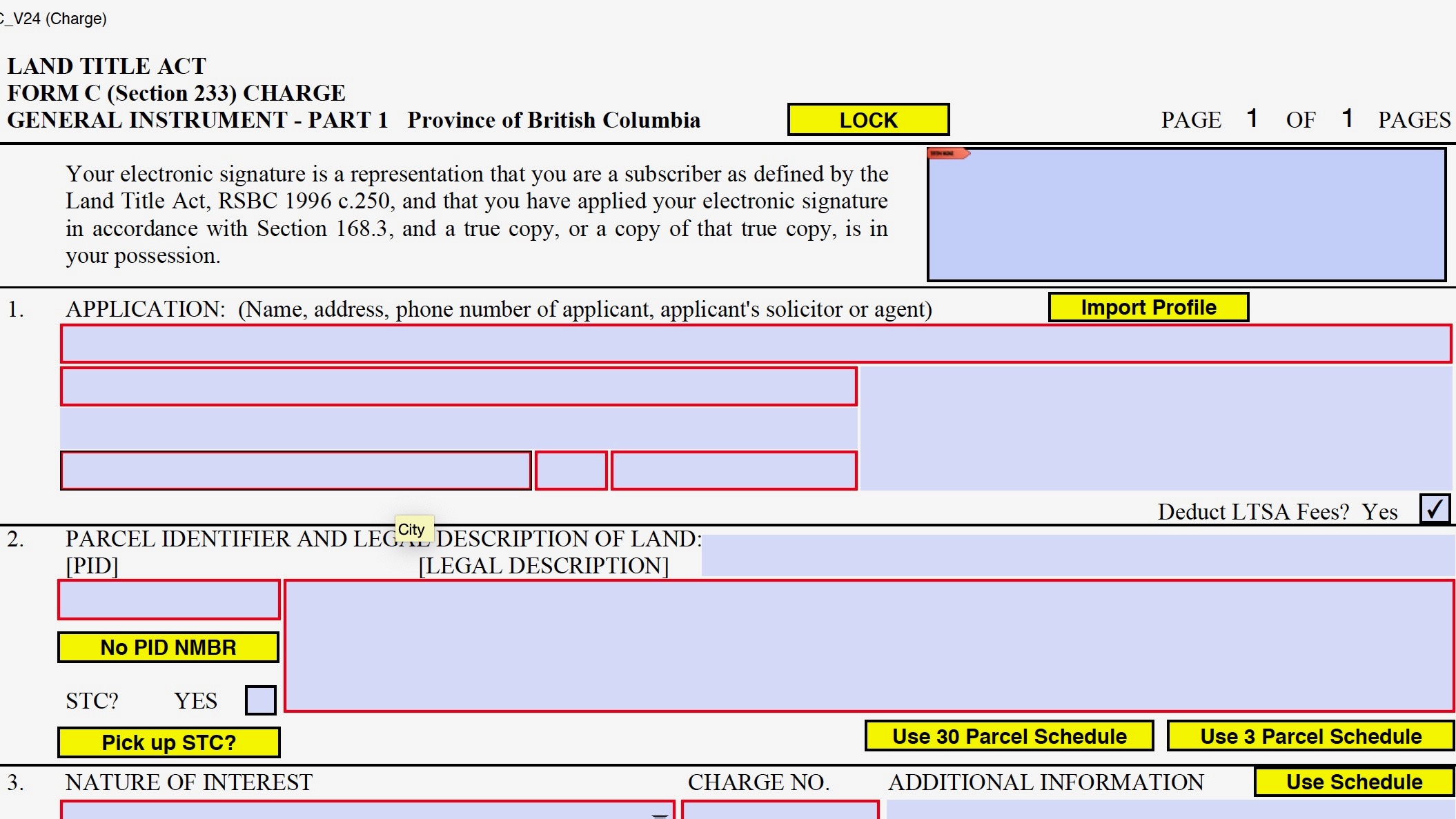
The land title is a fast-paced industry. Legal professionals are often under strict deadlines to complete and submit applications that comply with the Land Title Act to avoid legal charges. Therefore, filling out applications correctly and efficiently is key to them. In the current system, PDF forms don’t have enough help and instructions, which causes errors and confusion in the application process for legal professionals. Legal professionals have to refer to a multi-page guide or call the LTSA for help to understand complex forms. This can slow down the filing process and, therefore, put their career at risk. Also, the portal is not mobile responsive and requires access to a desktop computer, which makes it harder for legal professionals to complete their work remotely.
Design Process
I followed an iterative design process to help me continuously improve and polish my designs.

Research Methods
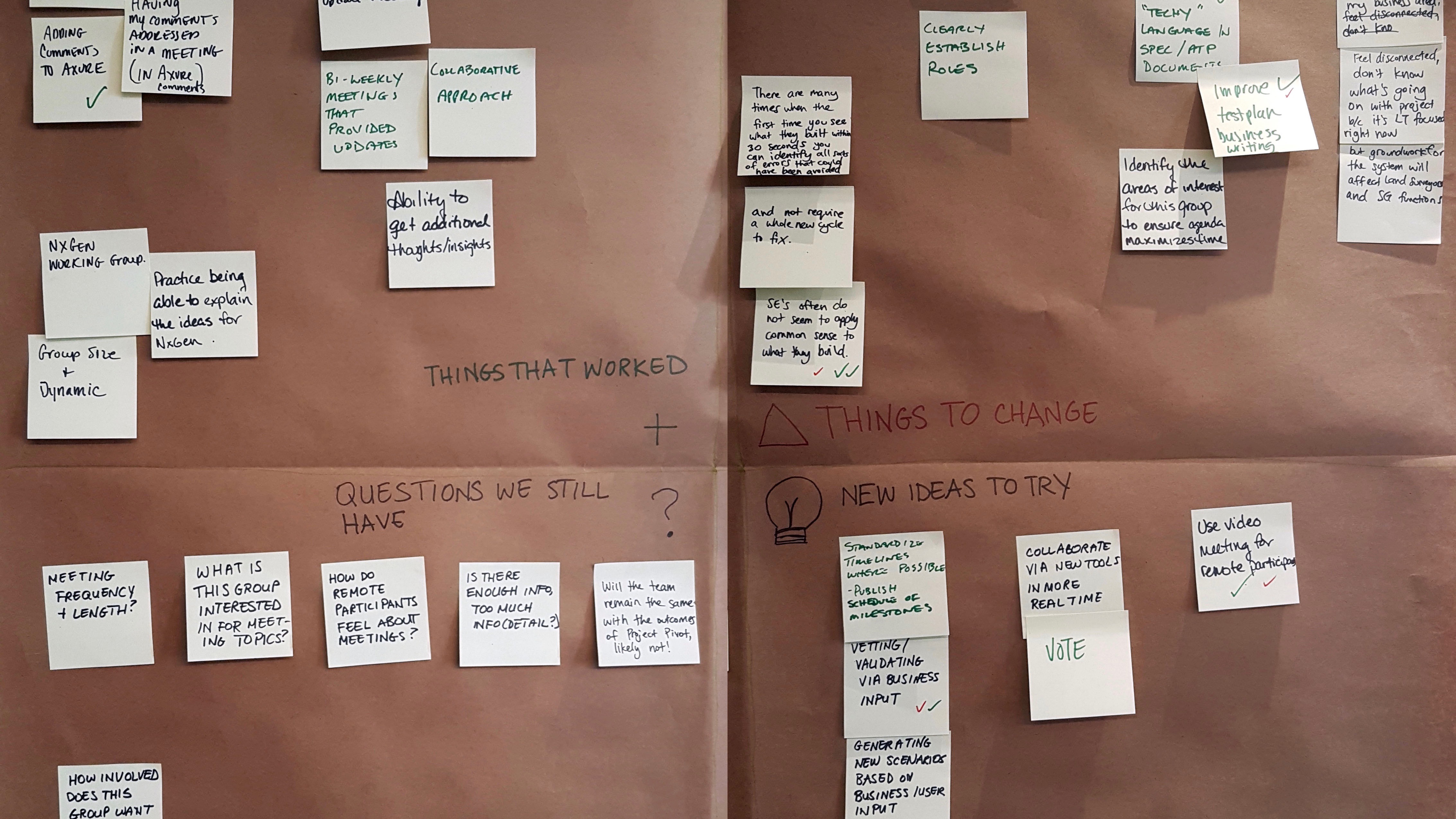
- Workshops: To better understand the challenges customers face, I conducted a series of customer consultations. I prepared the consultation plans and met with LTSA customers to better understand their workflows and pain points. I interviewed lawyers, notaries, and paralegals and captured their input for user journey maps and personas. With the data gathered throughout customer consultations, I created reports and presented suggestions and solutions to improve existing features.
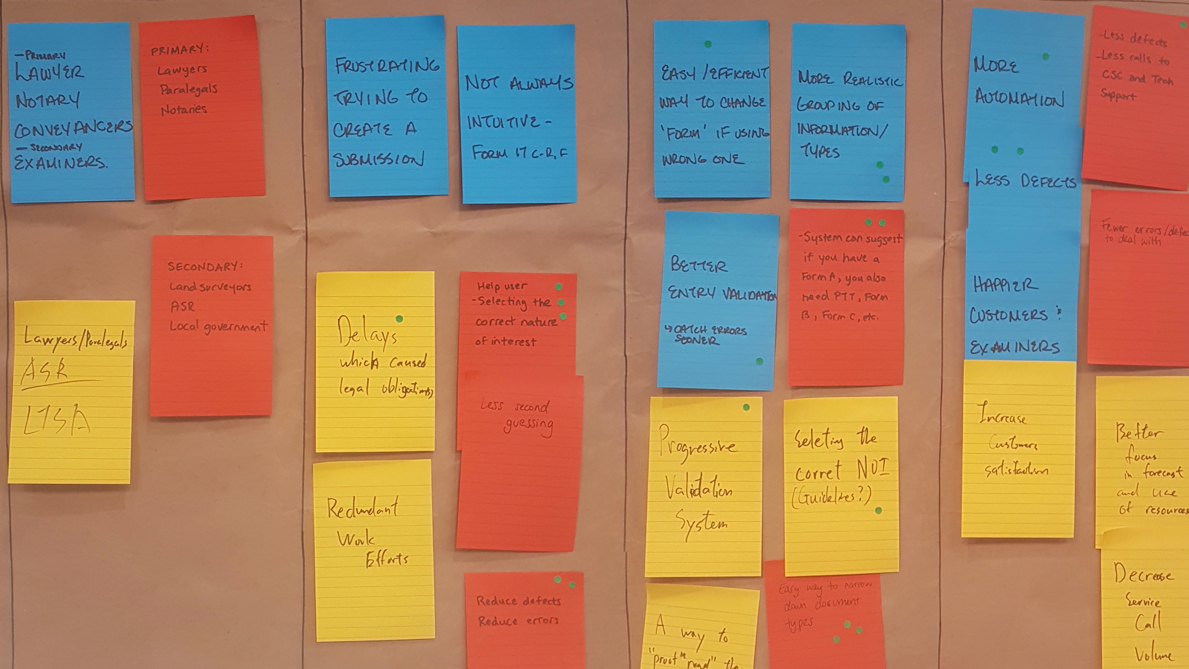
- Personas: I used personas to build empathy with users and identify what they need. I wanted to focus on expert legal professionals and users new to the field. I referred to different user groups and validated personas with the customer during customer consultation sessions to update and verify the information with users.
- Journey Maps: I used the journey map to identify, user’s thought process, frustrations, questions, and concerns, and opportunities to improve. I facilitated various workshops and gathered user’s input about different processes involved in the land title industry.


Validating Assumptions
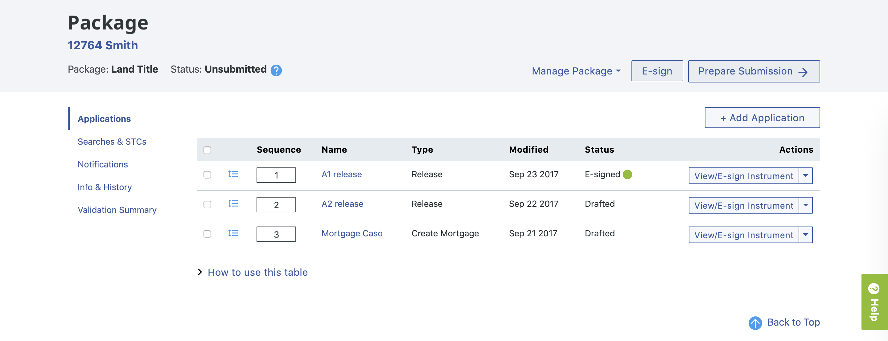
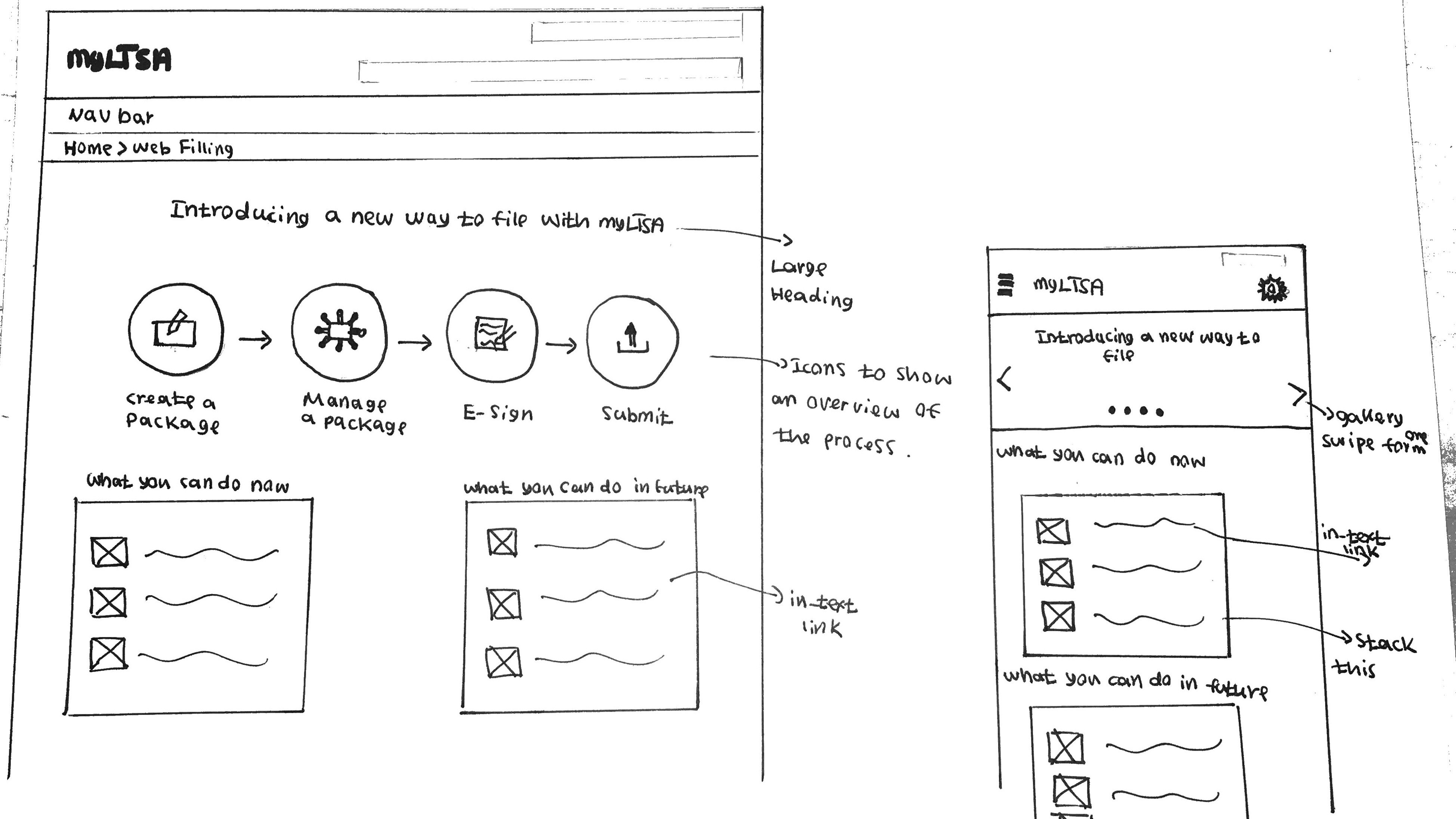
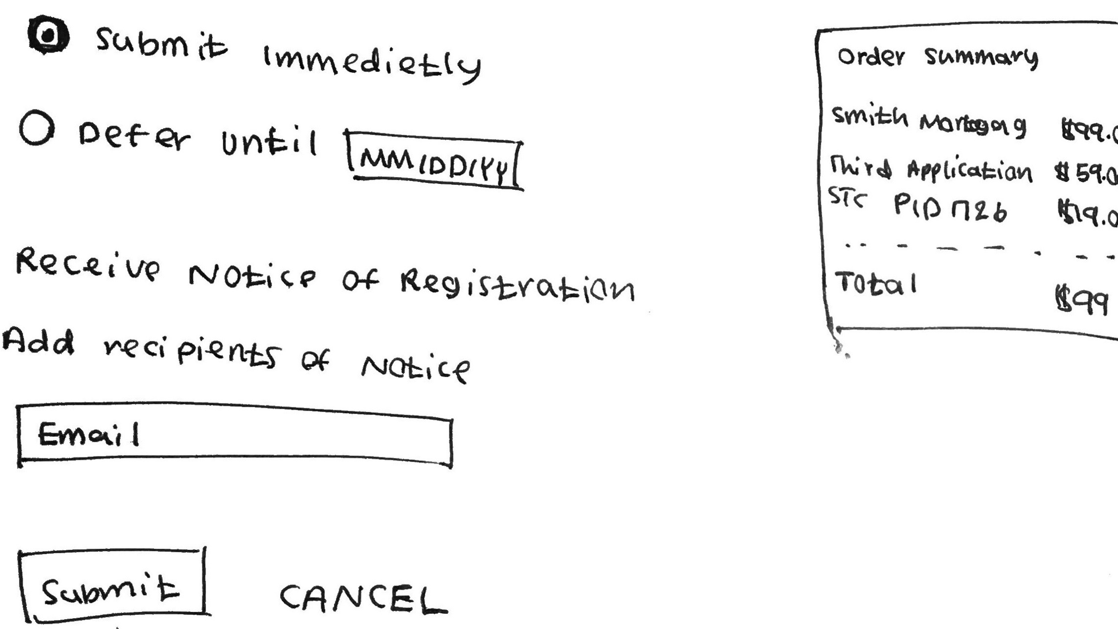
The team had an assumption that lawyers and paralegals use the Package page the same way. I ran usability evaluations to confirm this assumption. The usability evaluations helped the team understand how users use this page and reduced development effort and cost by creating a design that was validated with end-users.